

NIKE SNEAKERS APP (case study for sdsu)
the company
Founded in 1964 as Blue Ribbon
Sports, Nike is the world’s largest apparel
company. They Employ over 76,000 people worldwide, and in 2021, they made 44.5 billion in global sales
Nike’s mission ~ bring inspiration and innovation to every athlete in the world. This mission drives them to do everything possible to expand human potential. “Our purpose is to unite the world through sport to create a healthy planet, active communities, and an equal playing field for all.”
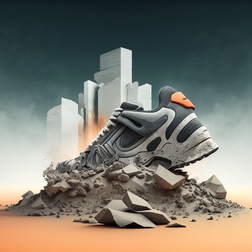
Nike x Brutl collaboration concept by Jovan Sotelo
the problem
Nike continuously explores ways to connect with their communities, one of which are “Sneakerheads”, or people who collect and trade sneakers as a hobby. Their app, SNKRS, provides “insider access to the latest launches, hottest events, and exclusive releases that Nike has to offer.” This will be another feature as part of the app.
As part of Nike’s initiative to become a digital-first, direct-to-consumer (D2C) company, Nike has set out to reach 30% of their total sales being driven by e-commerce revenue. For this project, Nike wants to release a new feature that allows users to connect with one another and create community.
The goal of the project is to design the feature for customers to discuss and share their love for Nike sneakers. Similar to the reddit forums, buying, selling, and trading shoes on the app would be prohibited.

THE SOLUTION
THE SOLUTION

Design a feature that allows SNKR app users to connect with one and other & create a community.
The Primary goal for this feature is to allow customers to discuss and share their love for Nike sneakers. We aim to allow them to interact with their community in multiple ways.
HOW MIGHT WE?
Increase user experience through the SNKRS community function in order to improve brand loyalty and drive sales?
my role
for this project, i was a ui/ux designer who:
Produced Mid and High Fidelity Wireframes.
Constructed a working app prototype.
Designed professional mockups.
Helped to create a set of cohesive brand guidelines.
Performed a user testing session.
Research.

4 weeks | 6 designers
Research
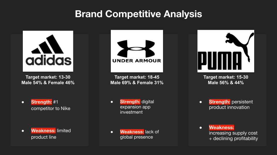
My team, HypeBeasts made use of the resources provided to create Competitive Analysis charts, and to understand
○ Nike’s Mission Statement
○ Nike’s Values
○ Target Audience
○ Branding Strategy
○ E-Commerce Strategy

questionnaire
Using our research, we developed a questionnaire that was distributed on social media and sneakerhead message boards. After we gathered our results, we began to create our user personas and identify key pain points.


Results
Results
After getting back the results from our questionnaires, We found that the Biggest motivation for purchasing sneakers was -
1. Style
2. Comfort
3. Durability
62.5 % of users are interested in what other sneakerheads are purchasing
75% of users never used an app to showcase their collection
87.5% of users wanted to communicate with the sneakerhead community

User testing
In testing the current iteration of the Nike SNKRS App, Users felt overwhelmed by discover page.
Users wanted to see a message board to communicate with others
“What You Got” section of the “Discover” was frustrating to users
Users felt the “Feed” page had too many ads
Pain Points
Exhaustion due to overwhelming content on feed and discover page
No clear understanding what the app is for
Feels like one big ad
Wireframes
Wireframes
Using all our knowledge we began to execute what our App Extension would look like. Our journey took us from building a style guide, to user flows then onto crafting Low Fidelity to High Fidelity Wireframes
-
![]()
Typography
Style Guide
-
![]()
Logos +
Style Guide
-
![]()
Icons
Style Guide
-
![]()
Buttons
Style Guide
-
![]()
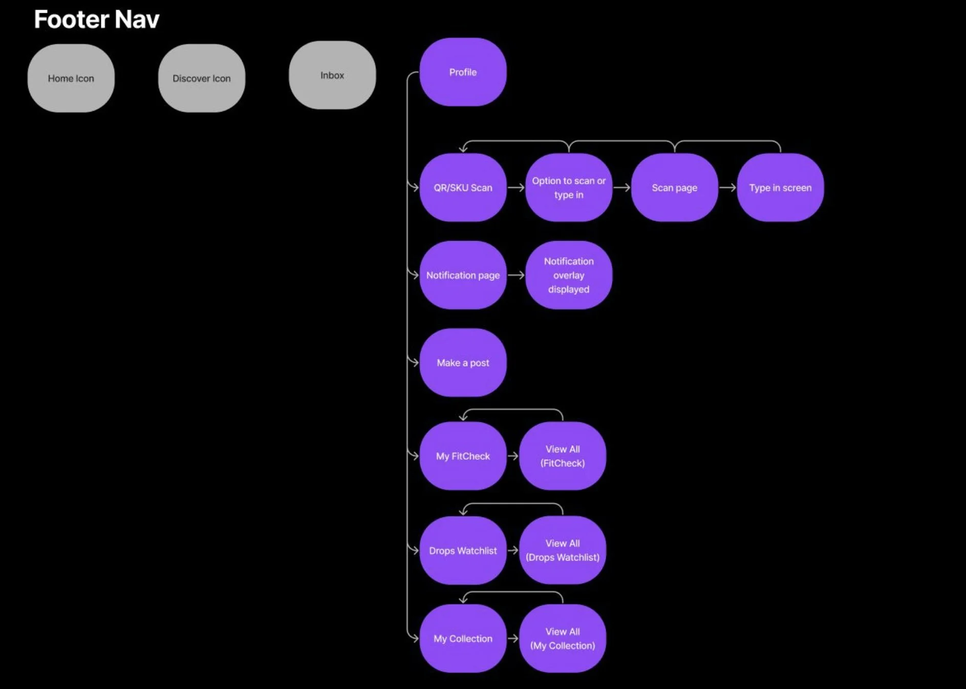
Footer Navigation
User Flow
-
![]()
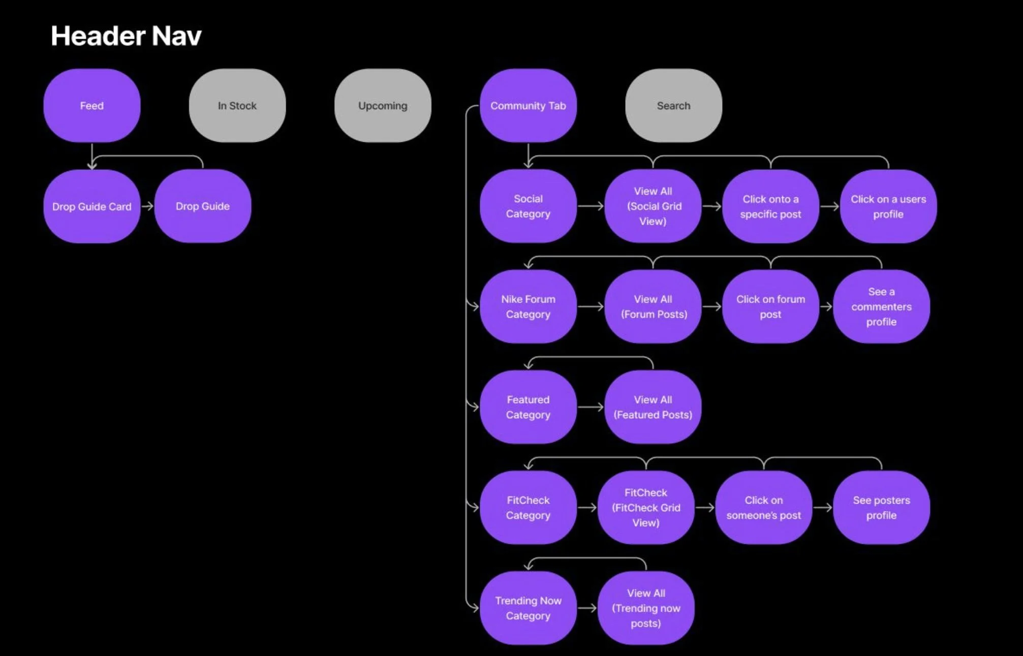
Header Navigation
User Flow


low fidelity

mid fidelity
high fidelity


User testing methods
Monitored Usability Test
We asked our users to complete specific tasks.
We monitored usability along with the emotional journey that they went through while attempting to complete these tasks.
final results
We identified patterns that caused users to become frustrated
We discovered FitCheck & Social Grid pages caused confusion and were too similar
Users had trouble navigating and understanding the Profile Page
We received helpful feedback for the My Watchlist section
Our results allowed us to iterate on our designs and improve the overall look and flow of our features.

Just
Do
It
onboarding
No.More.Guessing.
Users can now learn how you can “Cop the drop” right at the beginning of their sneakers app Journey, with our special Onboarding section located right on the home page.
snkrs forum
Want to keep in touch with fellow Sneakerheads? Our new forum bridges the gap and allows our users make meaningful connections with one another. A new dawn, A new connection.
Profile page
Personalize your experience with your very own profile page. Here you can showcase your collection using the barcode scanner, have a Nike wish list, keep up to date with friends and show off all your fits.
trending now.
Keep up to date with the latest trends with our “Trending Now” page. What comes next? You’ll always be in the know.
final thoughts
In our final assessment for this project, we invited our users back for a follow up interaction. The results were incredible and our users were delighted in all the different ways we incorporated their feed back. If I were to redo some elements, I would like to incorporate some more stylistic features that fall in line with Nike’s more trippy and psychedelic graphic designs. I would also like to do a more original profile page then the one we went with. All and all, I’m so grateful for this creation. I worked with an incredible team of talented individuals. Built with love, This project taught me a lot about team work, communication, striving for the best, time management and most importantly, it taught to me have fun.
